


These are mostly commercial works.

Some of this is design. Some of it is instinct. All of it is deliberate.


A little about the person behind this beautiful nonesense.


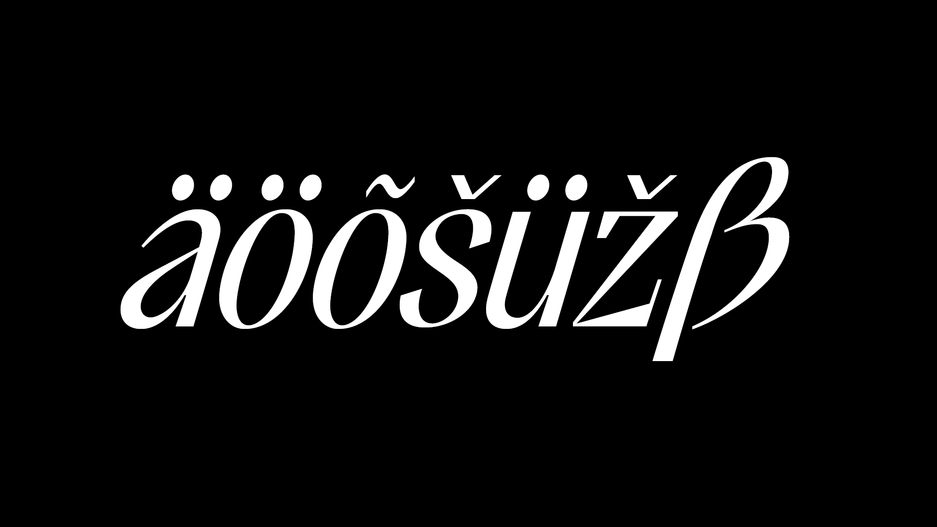
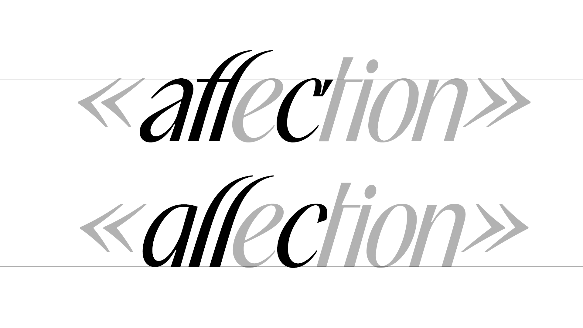
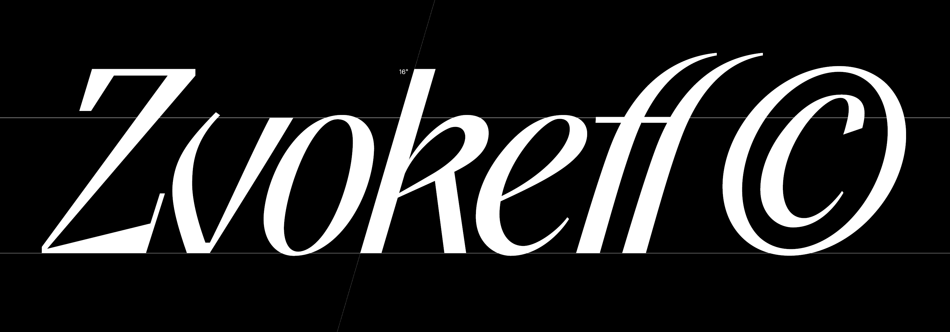
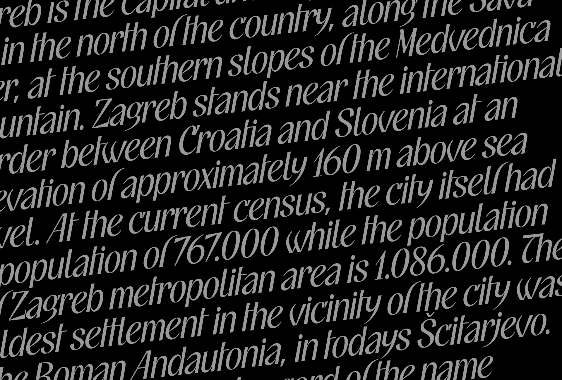
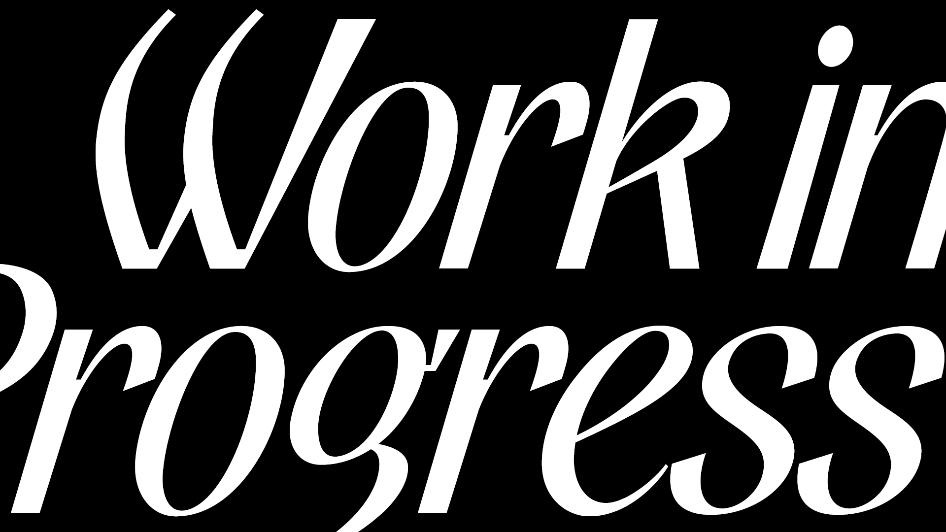
Excentrica began as a small exploratory sketch series, where I experimented with expressive, off-balance letterforms and unconventional italic motion. What started as spontaneous visual research gradually evolved into a full Italic typeface, now developed as a variable font spanning Light to Bold. Throughout the process I refined the structural logic behind the eccentric shapes while preserving the initial spontaneity and energy. Excentrica is still in development, but this first Italic cut represents the foundation of a future multi-style family and serves as my submission for ongoing collaboration with a local foundry.
A first concept in intalics
Name


If you enjoyed this case study, you might
as well like the next project.
